Our New Visual Identity

We have updated our brand to better reflect the company position and ambitions.

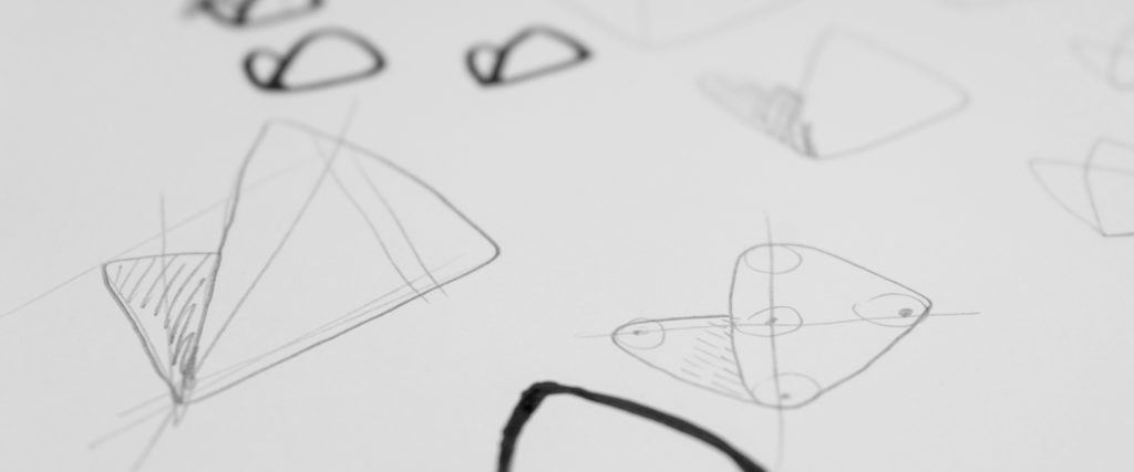
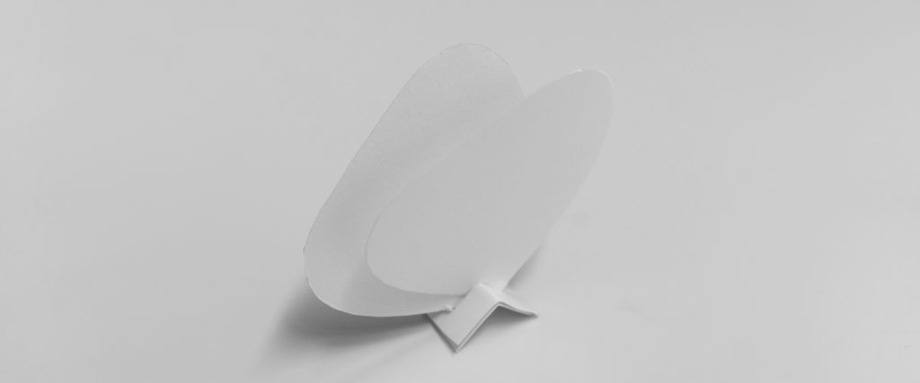
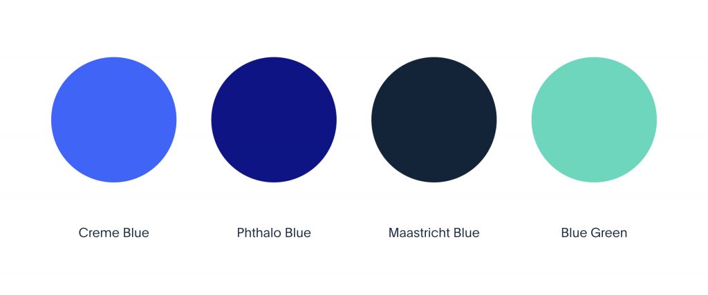
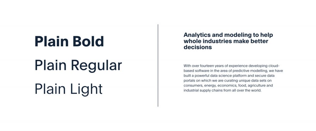
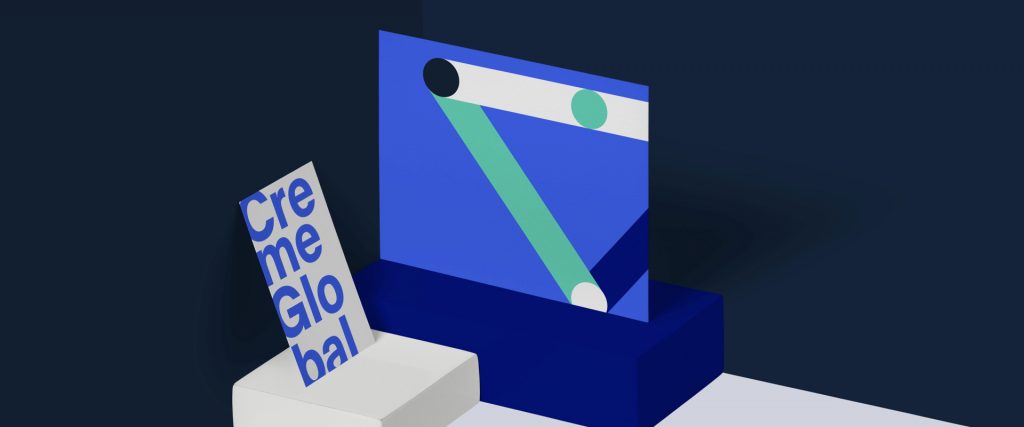
The launch of our new website is also accompanied by release of our new visual identity. We worked on creating visuals that better reflect Creme Global as an ambitious, growing company of experts with proven track record. Some legacy elements of our previous brand remain, such as blue being our main colour, and butterfly being our symbol – but our entire new branding has been designed from ground up – with the aim of refining our visual appearance and aligning it with our internal culture of innovation and expertise.

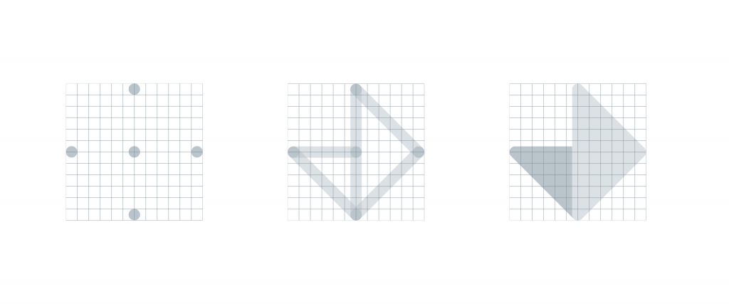
Here are some of the basic elements of our new brand.

You might also like

Sequencing techniques can shape the future of food safety

From a consumer health perspective, it’s vital that we can be sure the foods we eat are safe and are not going to make us ill. Microbial testing is one of the core components of QC in a food production environment to ensure there are no harmful bugs are slipping through into the final product.

Read more

Get weekly industry insights from Creme Global

DOWNLOAD THE OVERVIEW NOW

Data Sharing on Creme Global Platform

Gain critical business intelligence from shared, anonymized data.